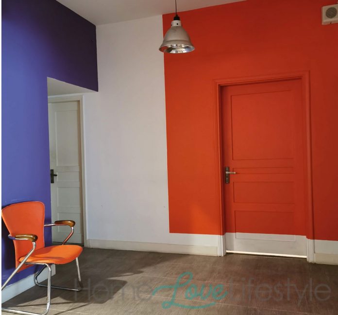
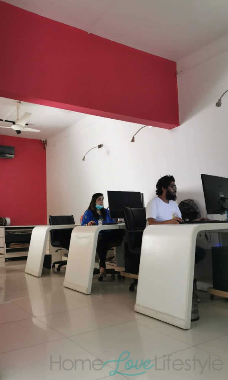
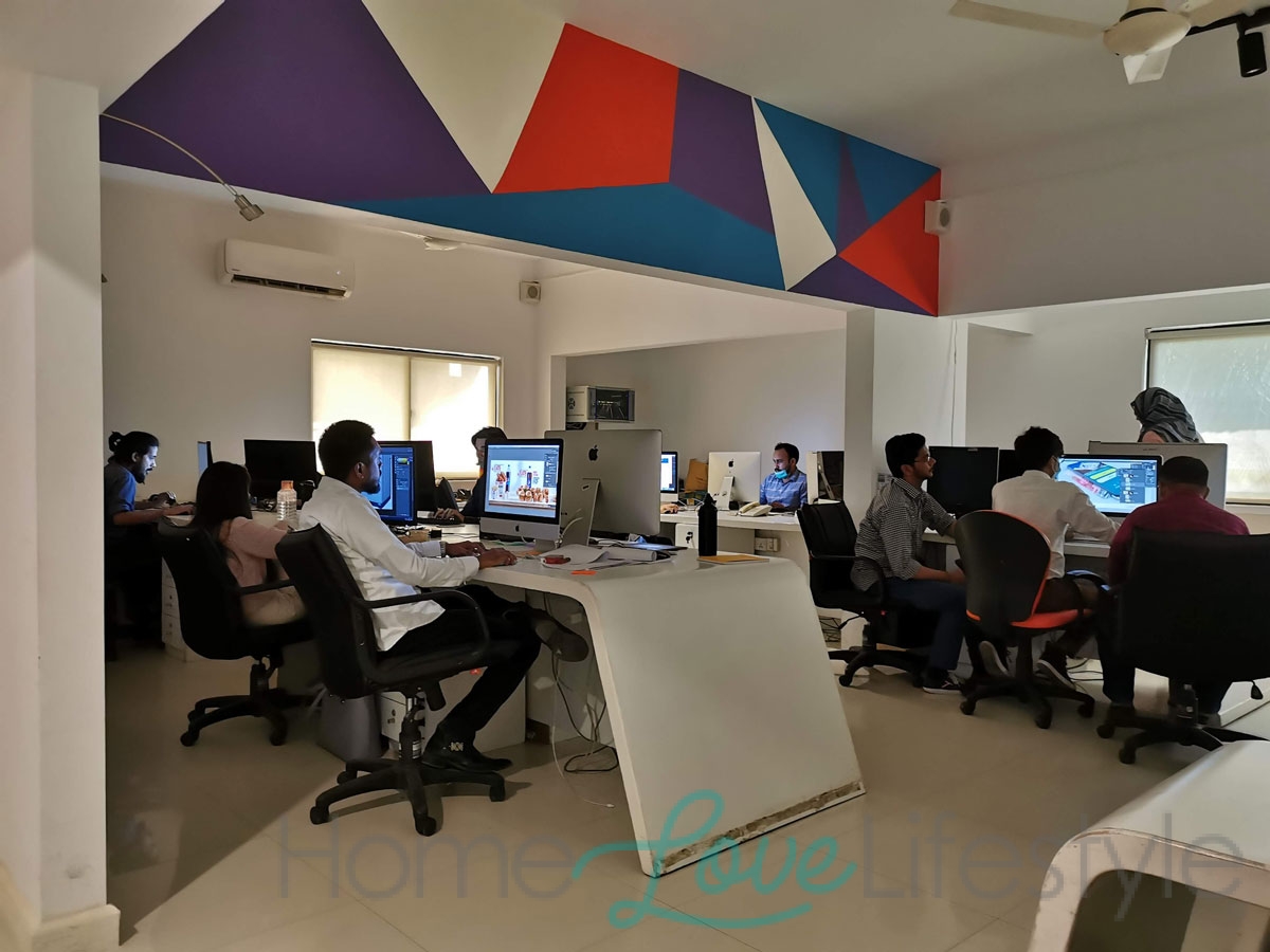
Welcome to the bright, colour coded office of the Synergy Group! The company, which is a 360 degree communication solution to all brand related needs, has opted for a bold and user friendly layout which can become a key element in motivating the work force and encouraging productivity.
We spoke with Maleeha Kapadia, the Director of Corporate Communications, and asked her about the new look.
How long have you been occupying this office building?
Why did you feel the need to renovate the office?
Did you get professional help?
Yes. Our design consultant was Naeema Kapadia who worked with the Synergy team.
What was the design brief?
The brief was given by our group creative director Maria Shamsi.
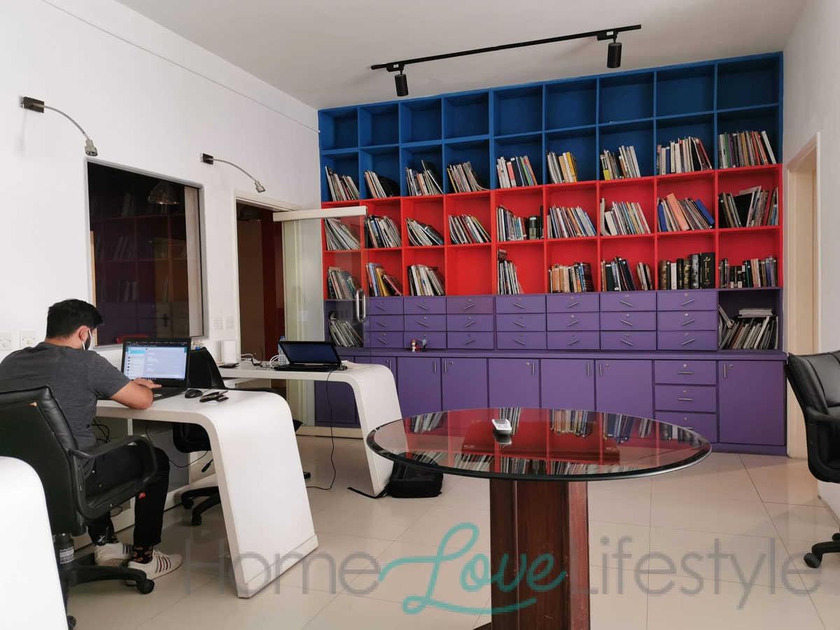
Maria: We wanted a space that was reflective of the culture of our group. The culture of inclusion, diversity, cross-functionality, of helping each other. The whole idea of Synergy, synergizing people as our name suggests. We need to be creative, to multi-task. We specifically wanted a lot of light to pour in.
The idea was to have an open welcoming space conducive to creativity. We spend long hours here and the many different departments, from our publications and portal to conventional advertising need to work well together.
What kind of ambience were you aiming for?
What other features had to be kept in mind?
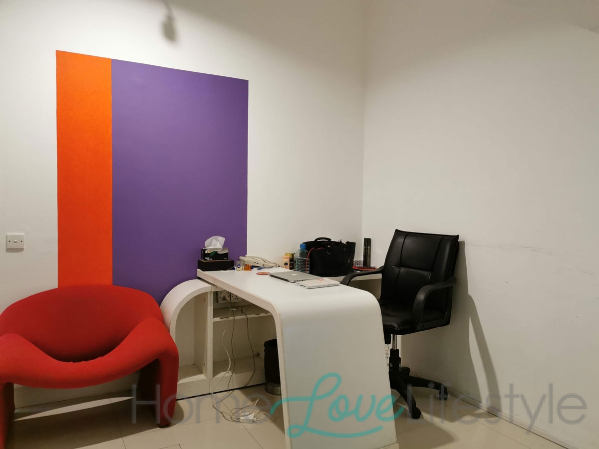
The most striking feature is the bold colour blocking? What was the thought behind this?
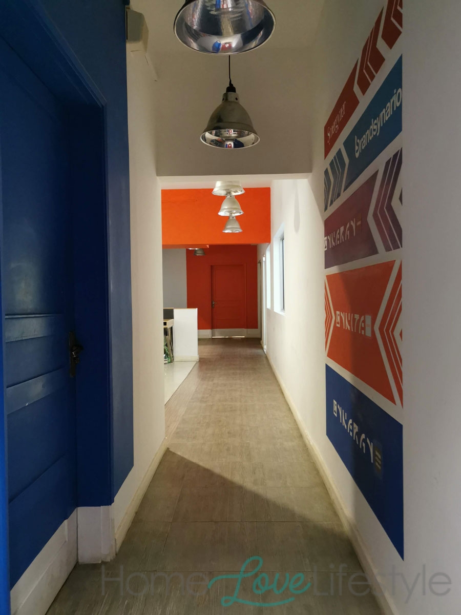
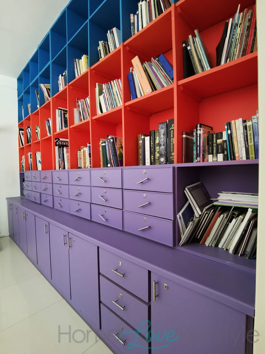
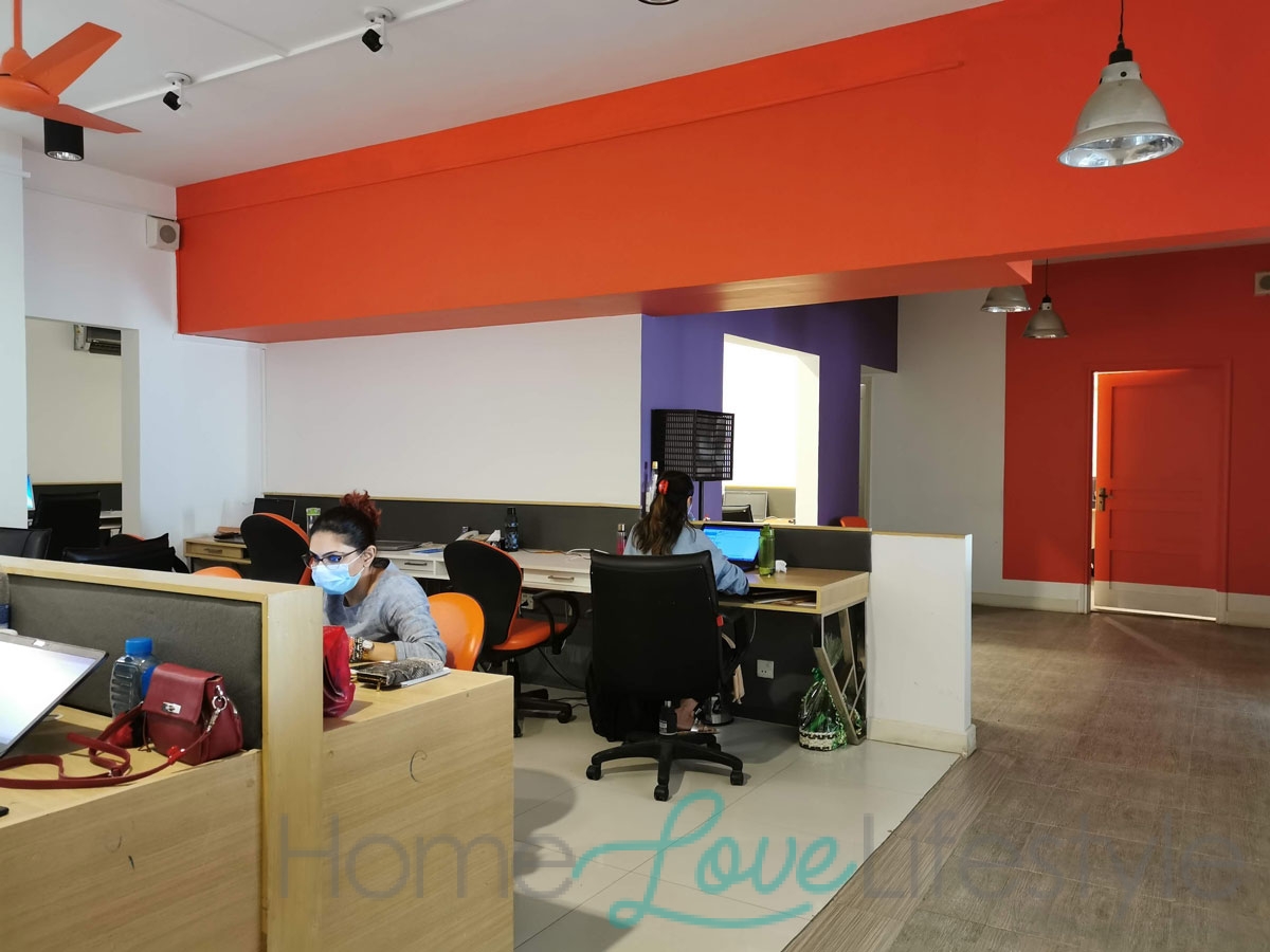
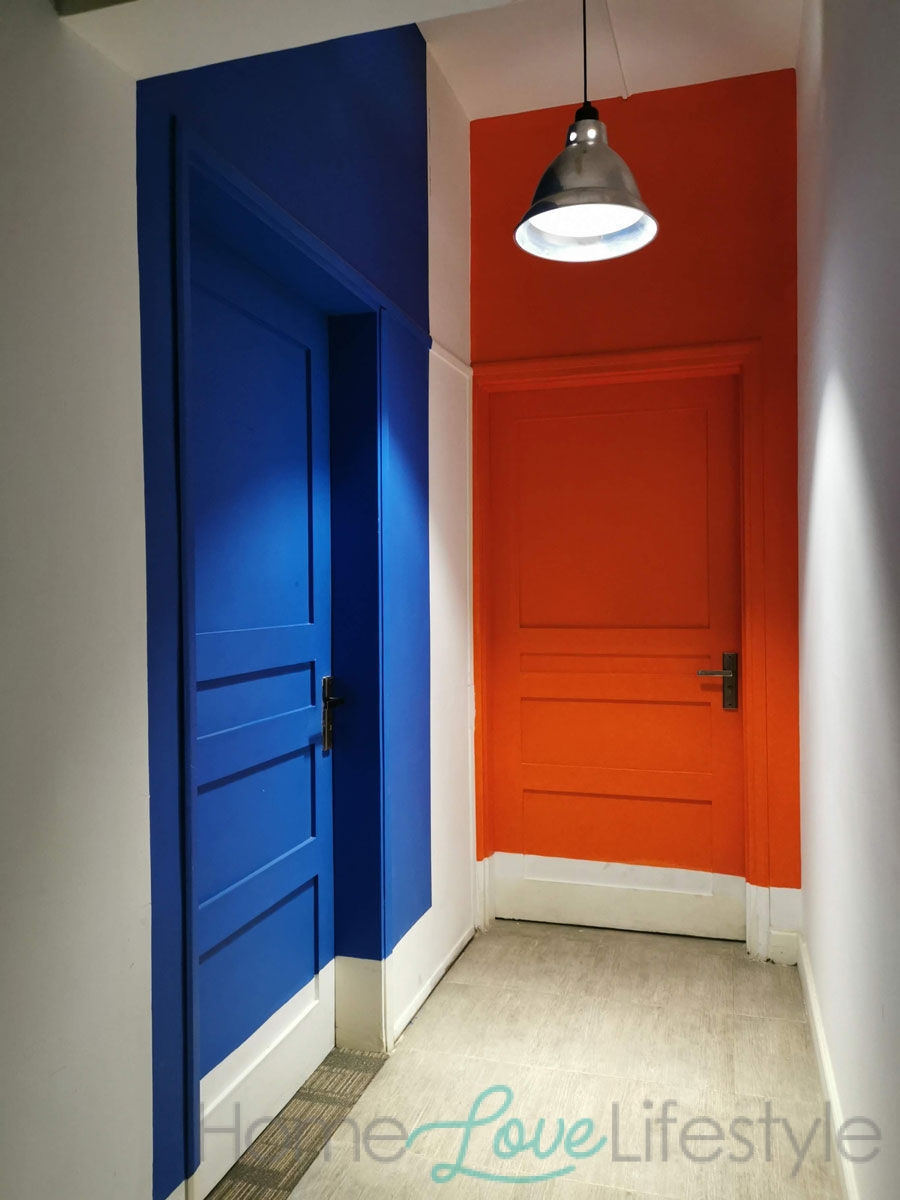
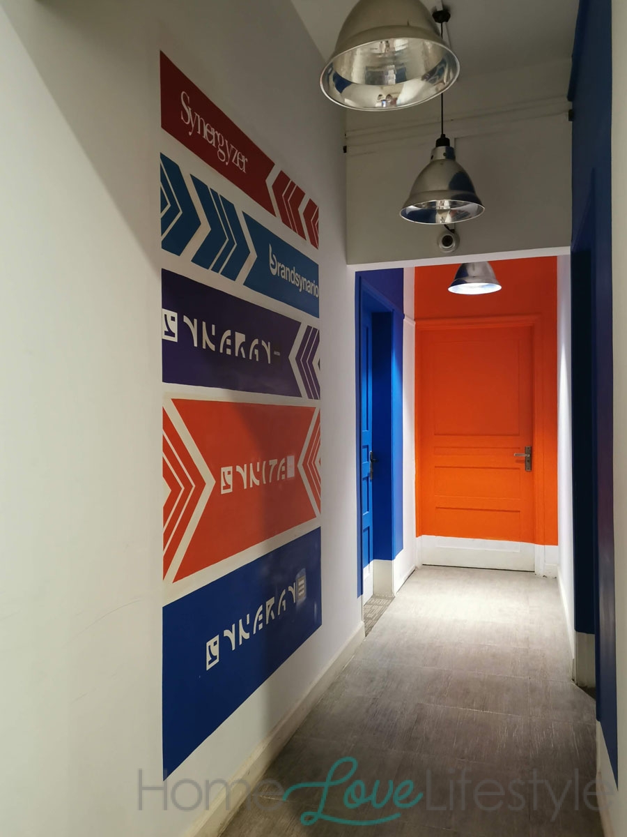
It was an effective and budget-friendly solution to the fact that we represent many companies. We particularly wanted to use our group colours and we simply separated the spaces by colour coding them.
We have also been careful not to be wasteful and kept some lights and some office furniture from our old space.
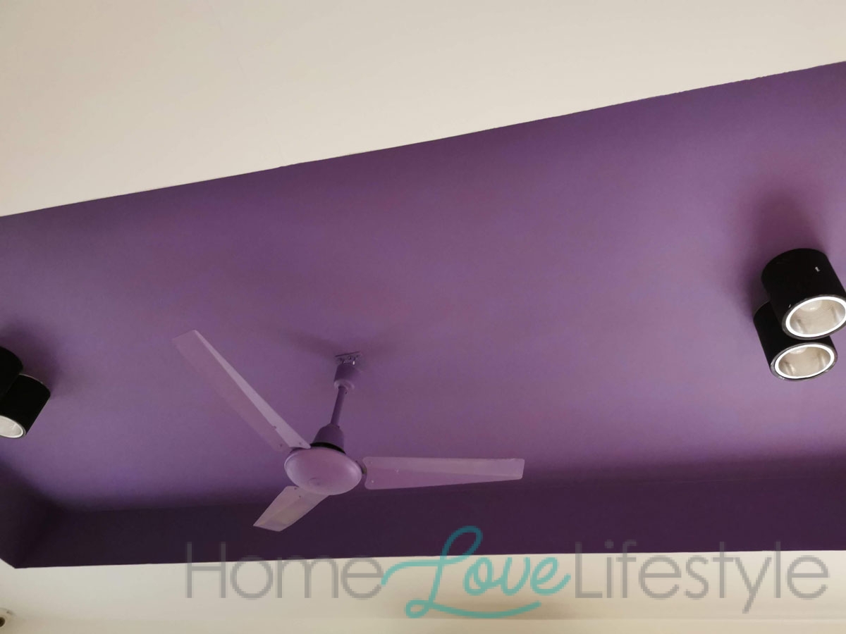
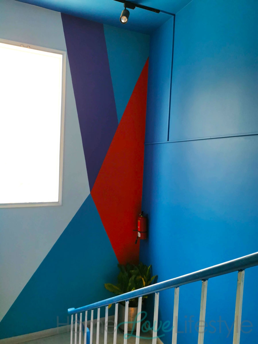
I think the designer had a lot of fun playing with the colours. As you can see, even the ceiling fans are colourful and we have striking patterns on many walls.
Was it easy to implement the new Covid related SOPs in the new office?
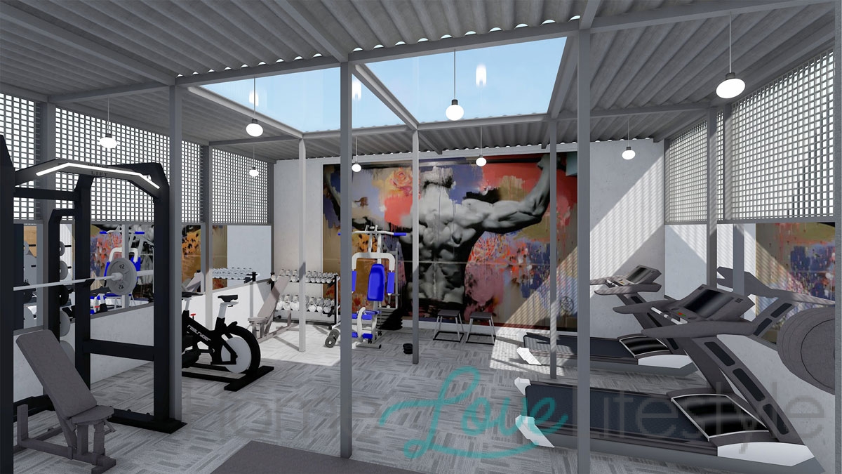
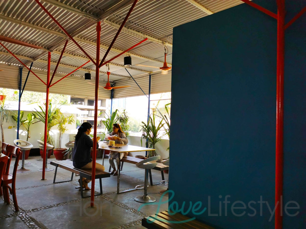
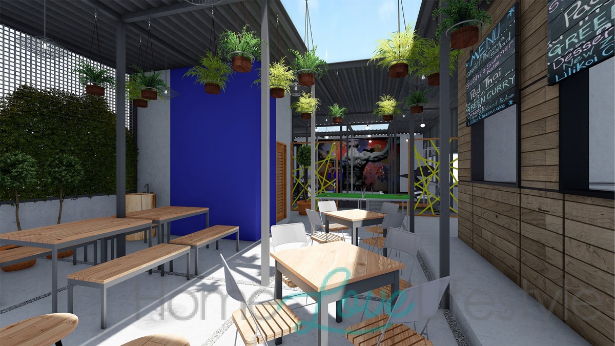
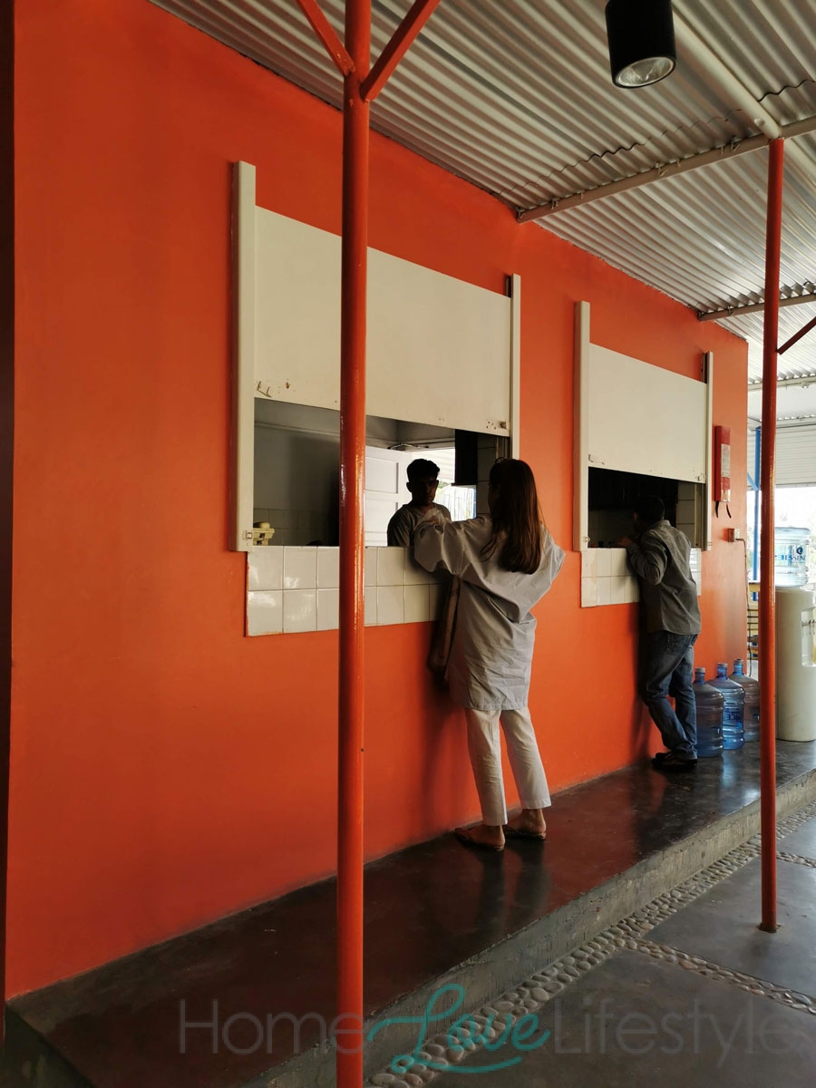
The outdoor rooftop cafeteria is perfect for the present situation. There is also a gym area. Is this space popular with the employees?
