Photography by Naeema Kapadia
Walking into the modern, minimalist home of Shajia and Mohib Haroon, one is instantly struck by the flow of space and clean lines. Shajia definitely believes in the ‘less is more’ mantra and her minimalist design sense characterizes the whole house.
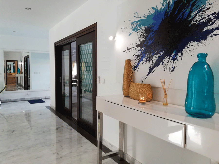
You have a very modern, minimalist vibe going on here.
Yes. I wanted a very modern look. For one, it’s very low maintenance, smoother lines, a clutter-free environment is easier to dust and maintain. I think it also looks nicer as long as you have one thing you really love and it stands out.
I find the whole idea of not buying unnecessary things really attractive. We already see so much wastage, we buy and buy and then end up giving things away to others who probably don’t need them either…
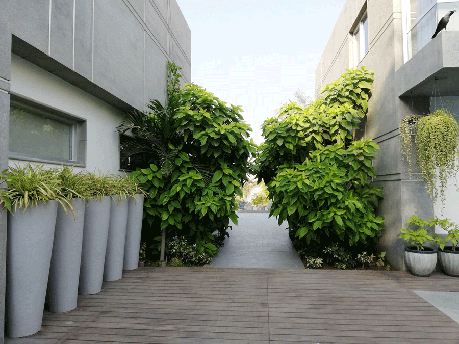
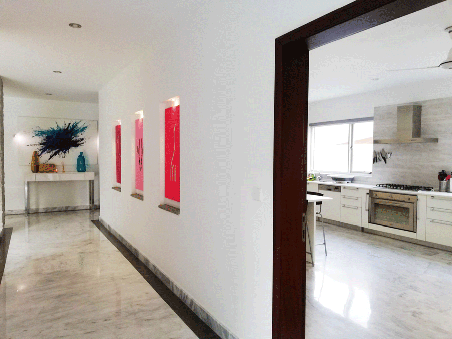
So what would you say is your design inspiration?
A lot of the house is still empty and I’m in no hurry to fill it. I really don’t mind bare spaces and unless I don’t really like something, I won’t buy it just to fill a space.
I think things should always be fun, cool, local. The home should be practical and welcoming. I don’t believe in buying very expensive things because I don’t want to worry too much about them. A home should be a place where people are comfortable, it should be user friendly.
Your living room is very striking. Tell us a little about it.
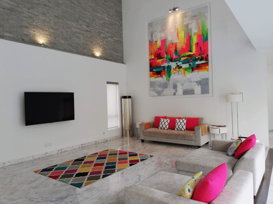
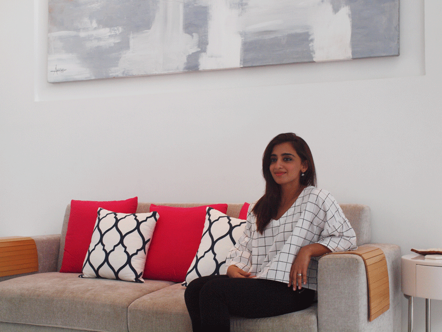
This is our main living space. I have two small children so we don’t have a coffee table and kept this area clear for them. Even the sofas are of a material that can be easily cleaned.
We wanted a double ceiling in this area. However, the challenge was that the space is enclosed on three sides and only one is open – it’s usually the other way around. So we had to break up the walls visually. The largest wall has the stone feature and it is also set back. The other one needed a large striking feature so I had this painting commissioned for it.
Tell us more about the painting which dominates the entire space.
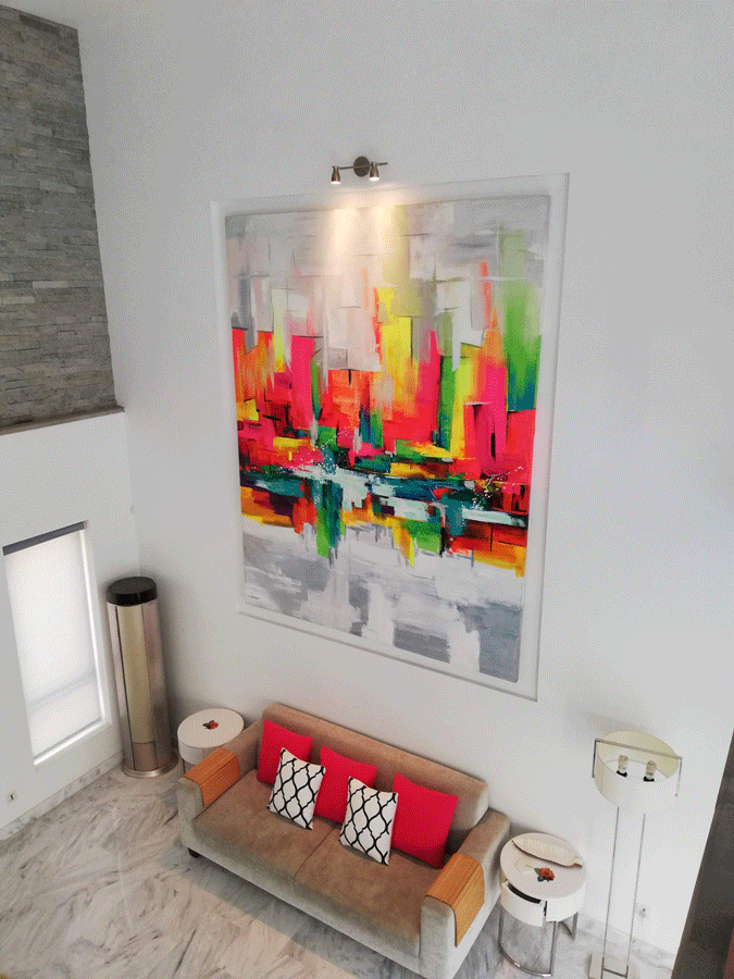
It was custom made for this spot and is by the artist Abdul Jabbar. I told him I wanted something abstract and in very bright colours. I love colour and actually encouraged him to go for fluorescent tones.
You have a beautiful pool area. Do you use it often?
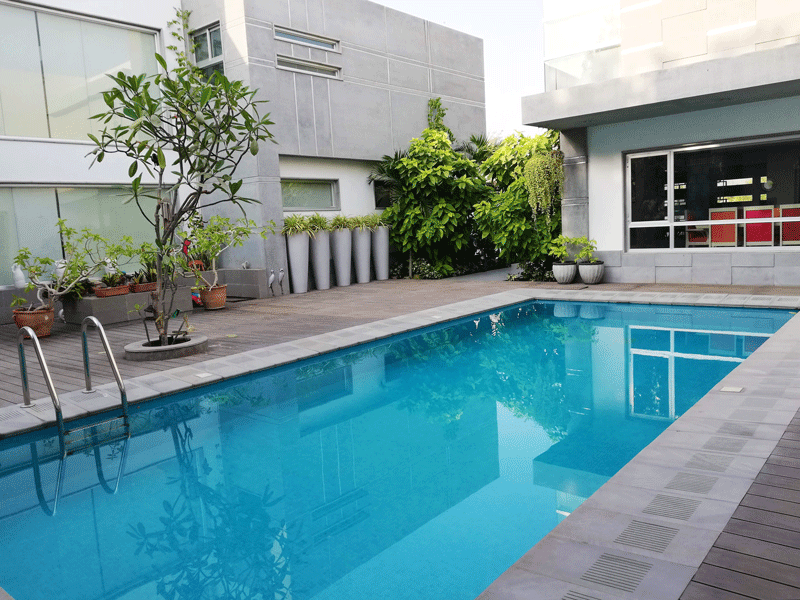
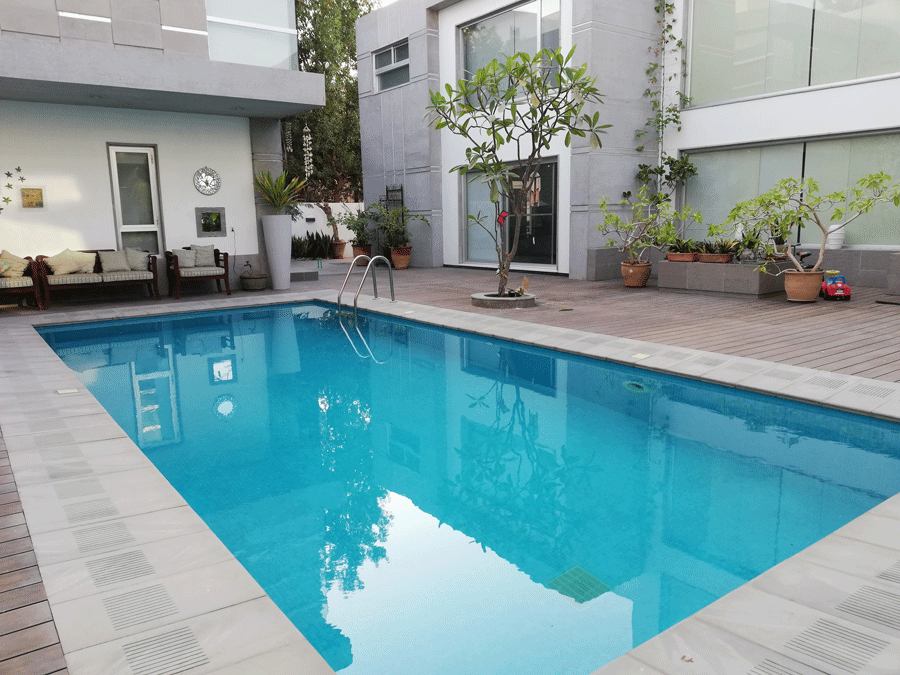
In summer we use the pool all the time. The neighbours are family and the staff don’t come to the back of the house so we are very relaxed. I’m a big believer in using what one has, there’s no point otherwise.
The kitchen is also a focal point in your home.
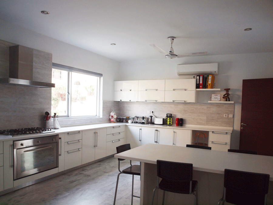
I cook for the family and we spend a lot of time here. It’s a very practical kitchen and we eat here, entertain here. In fact, this is the biggest room in the house. We have a separate grease kitchen but this space is only for the family.
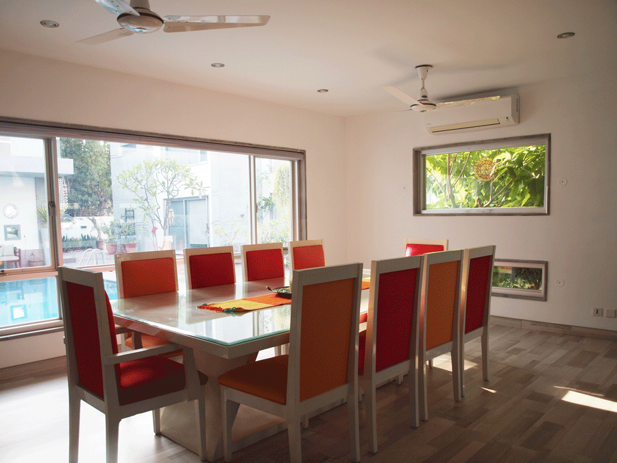
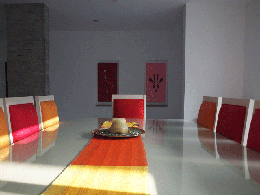
The dining room is used less often. It’s more for formal occasions. Then we pull back the chairs, open all doors and free up the space.
You have collected a very distinctive type of artwork.
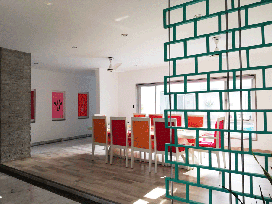
Art is different for everyone. For some people it’s about decorating or collecting big names. For me it’s about something I enjoy seeing every day. So it doesn’t have to be expensive or famous.
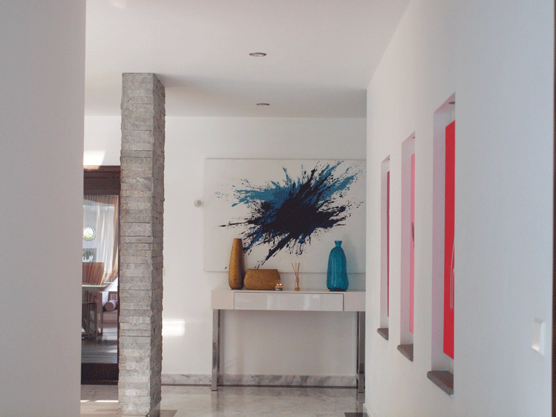
I don’t like collecting small things and displaying them. I like large, striking pieces or then a collection that can be displayed in a very creative, modern manner.
What is your favourite space in the home?
The lounge area I guess. We use that the most and we can relax there with the children without having to worry about making a mess.


