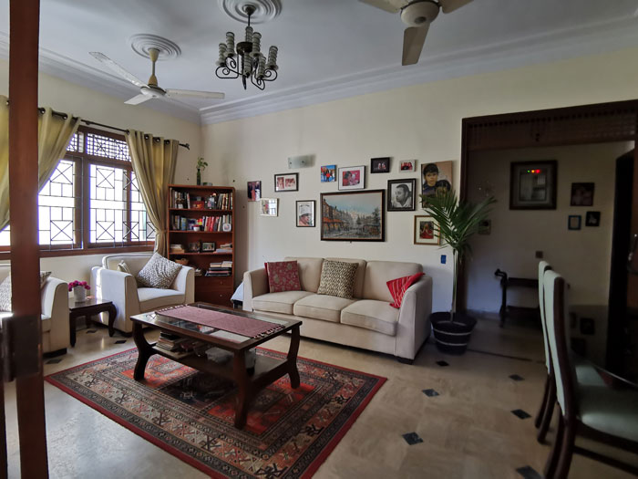
Team HomeLoveLifestyle is proud to unveil a recent home renovation project executed by us. We were contacted by a home owner who wanted to completely revamp her existing space. It was an older home purchased several years ago and the family had been living there for a while but no renovations had been carried out. It was time for a change!
Our ace interior designer Naeema Kapadia took on the challenge to create a stylish and practical space which could be adapted to changing needs. The entire ground floor including the outdoor parking area and small yard space as well as the indoors was transformed.Our team took on the project on a turn-key basis in which both design and execution was carried out by us.
This was a long due renovation?
Yes. We really needed a new look. The drawing-dining room, lounge, kitchen, powder room and hallway were all included. As was the outside space.
Did you make any structural changes?
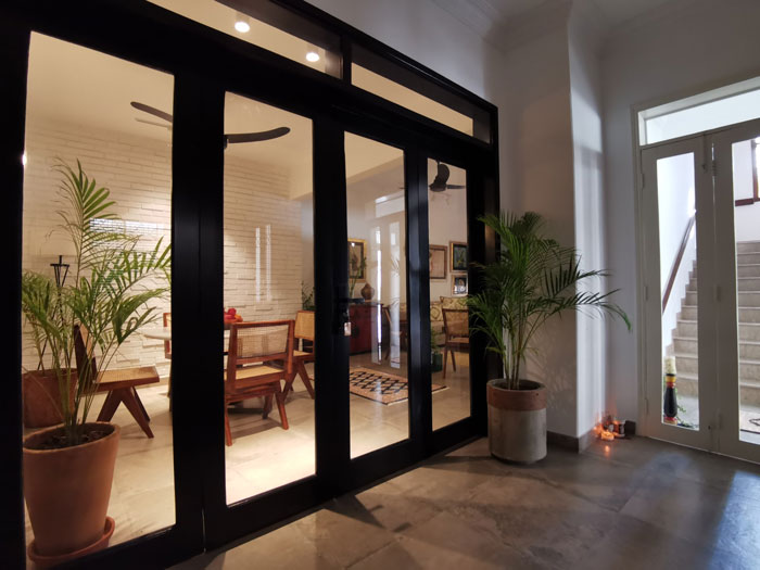
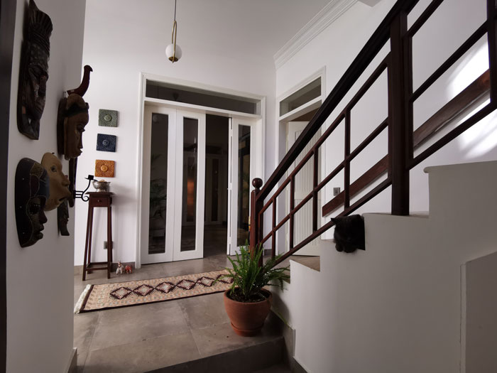
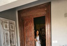
Not at all. In fact, the team was amazing in that they gave me maximum impact with the least disruption. They were happy to re-use existing fixtures where they could. For example, instead of changing the doors, they were re-purposed and painted white. One such connecting glass door was painted black instead of replacing it with metal and glass as we had originally planned to do.
But all the finishes were changed?
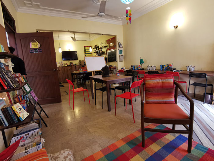
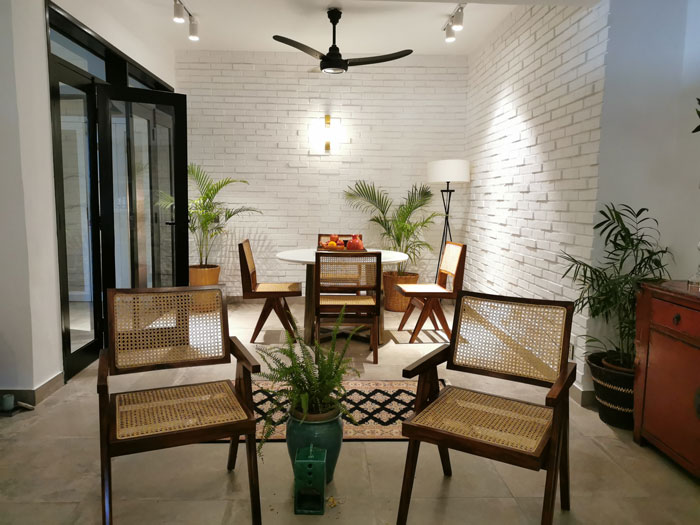
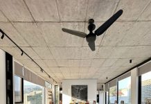
Yes. As the designer explained to me, ‘first we create the shell. Furnishings come later.’ However, she did show me renderings and simple mood boards, to give me an idea of the look we were going for. So all the old crown mouldings except one on the ceiling were removed. The flooring was completely changed from the old beige marble to large slate-coloured porcelain tiles. Feature brick walls were added. All the light fittings and the fans were also changed. These simple changes transformed the area into an open and bright space.
What kind of space did you envisage?
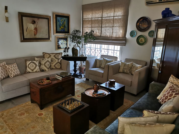
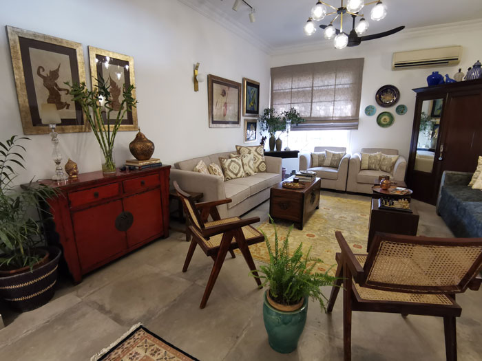
I wanted a warm yet elegant and stylish living space. But it had to be practical as well since I have young children. Luckily my aesthetic was completely in line with that of the design team. I trusted them completely and the finished look is very bright, open and contemporary.
Tell us about the soft furnishings.
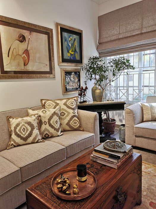
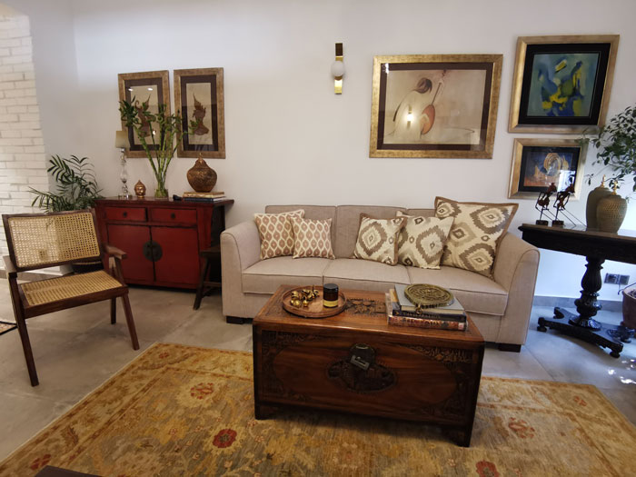
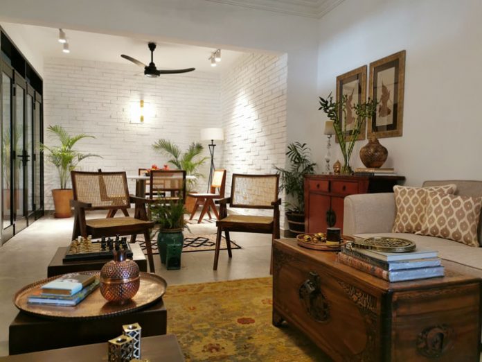
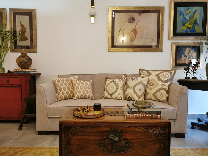
Once the shell was ready, we re-upholstered my old sofas to an off-white and a moss green. The colour palette was kept neutral. Drama is added by accent pieces. Once again, the team encouraged me to use furniture I already had. My antique red Chinese cabinet, camphor wood trunk and other pieces were all used. An antique cupboard belonging to my mother was restored and given centre stage by placing a striking collection of ceramics on top. All this saved me a lot of money as well!
What about the wall décor?
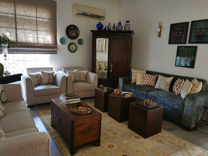
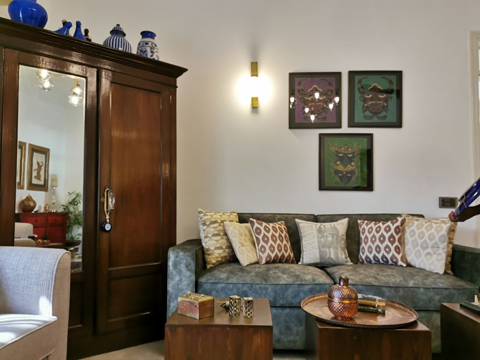
Wall décor was added by re-framing old paintings I already had while my collection of wall plates made another interesting feature.
What new pieces were added?
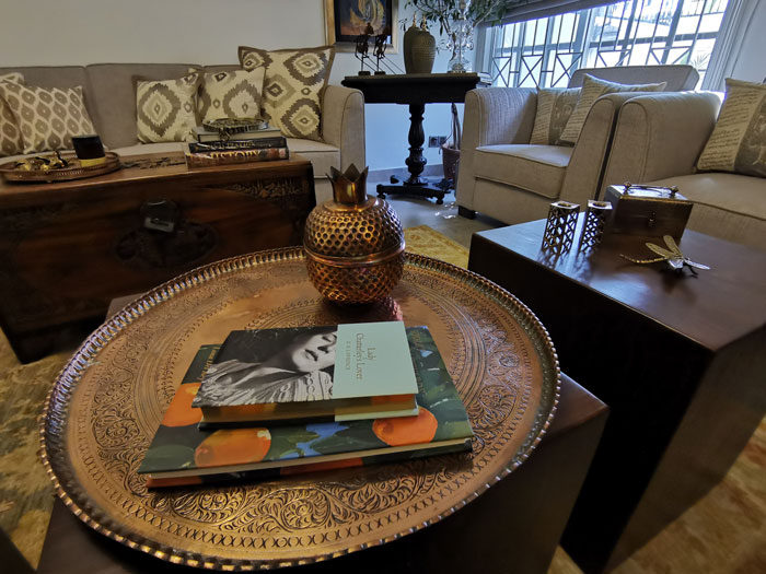
Wooden blocks were added instead of a conventional coffee table and a beautiful rug in shades of sage and rust adds warmth. Two chairs were added. I picked up some beautiful copper accessories and coffee table books to add to the room. The blocks were a great addition, also serving as nest of tables as they are so modular and multi functional.
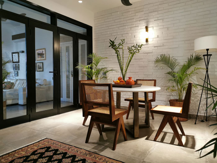
Now the dining area connects to the drawing room. The bricks on the walls add a bit of simple drama and texture and demarcates the space well. We had a round metal base marble-topped table made for this area with new wood and wicker dining chairs. A striking hand-knotted carpet finishes the look. Plants fill the room to add life and warmth. We are just waiting on a buffet cabinet or a credenza for the dining area.
What about the lounge?
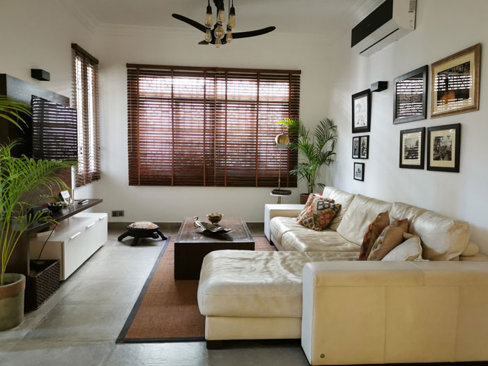
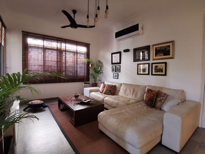
The lounge was completely transformed as well with new floors, electrical fixtures and paint. Wooden blinds replaced the old curtains. A new cabinet was added for the TV and gaming consoles and the comfortable sectional leather sofa, which is my children’s favourite piece of furniture. Framed photos, a stylish lamp and plants create the perfect casually stylish ambience. It is a perfect family space which not only looks great, but can handle two active young boys.
The kitchen is also new?
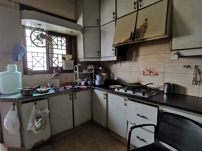
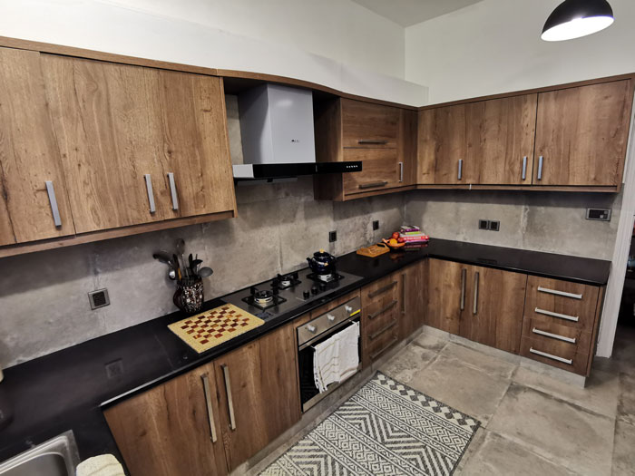
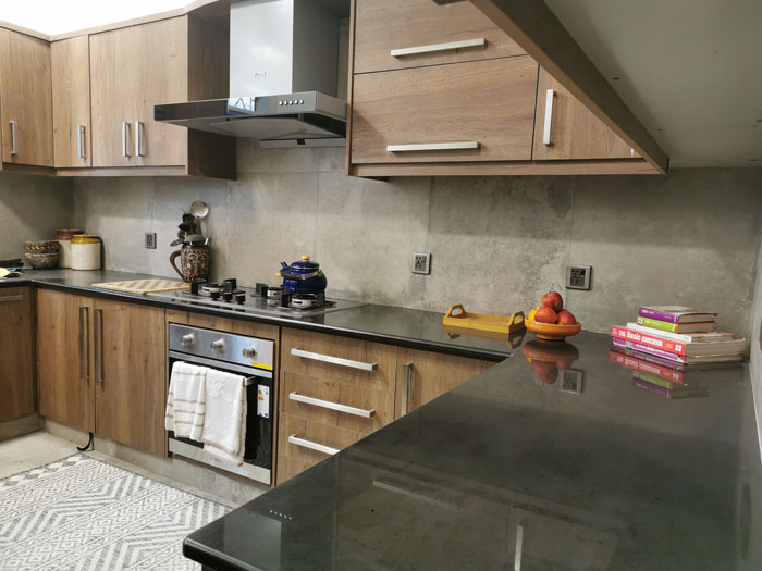
The old kitchen was completely gutted and built again. The same slate grey floor tiles continue into the kitchen and feature as the backsplash as well. I love the new cabinets in warm wooden tones. From being completely out of bounds, the kitchen is now a space where my boys look forward to baking.
You also have a new powder room.
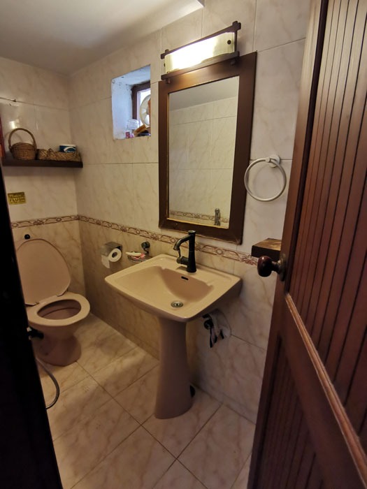
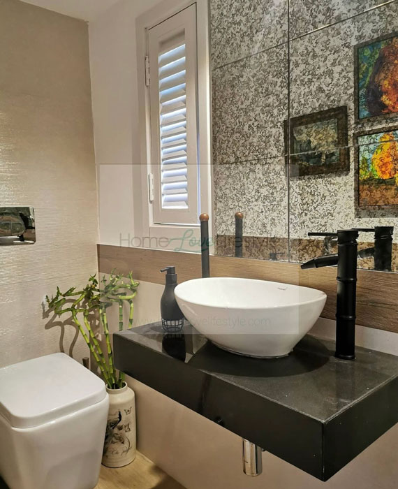
This too was completely broken down and revamped. All the tiles, fittings and plumbing are new. A shutter window adds a lovely design feature with the exhaust tucked neatly behind it, as does the distressed mirror which gives a vintage look. Mirrors also add to the illusion of space in a small area.
What about the outdoor space?
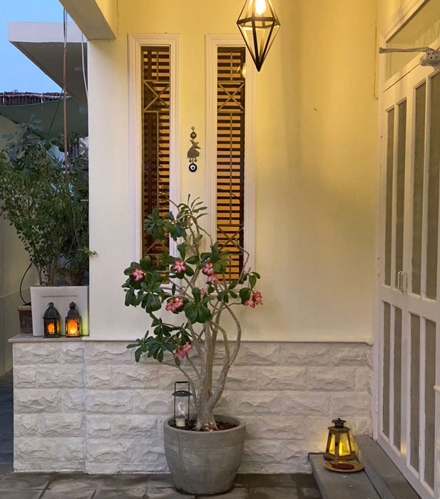
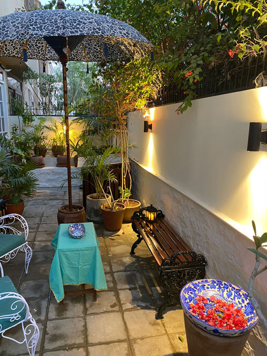
The floor pavers were changed and local gizri stone cladding was added to the walls outside. A bench, plants and accessories have made this into a lovely outdoor entertaining space.
So did the home renovation meet your expectations?
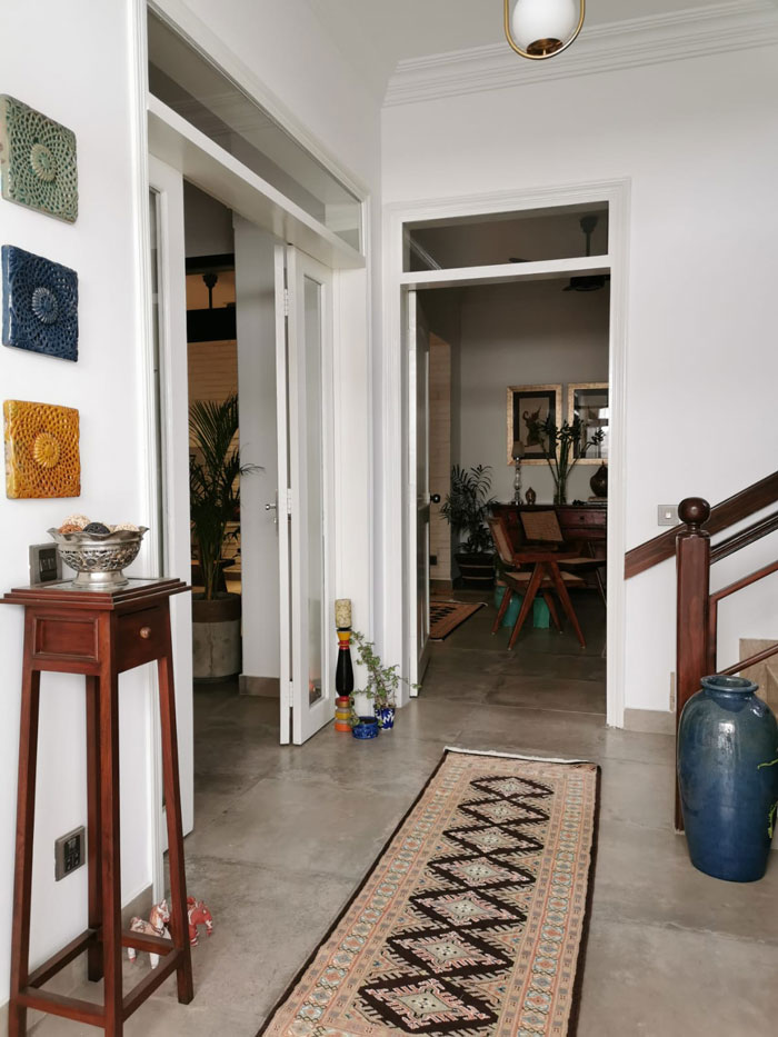
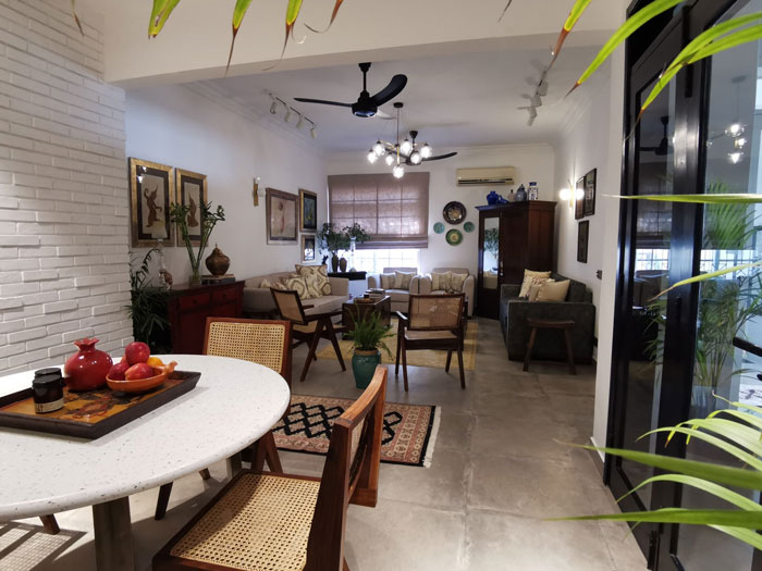
I am basking in the compliments. Some people asked me if I had broken down walls because the area looks so much bigger. It is a beautiful warm living space where I am really enjoying entertaining and spending time.
Photography by Naeema Kapadia


