This elegant home was renovated to give it a light, ethereal ambience. Interior design is a creative field and when a home owner gives you free rein, it is a designer’s dream come true. Of course the interior design team of Shahida Khan and Naeema Kapadia followed their clients Design Brief which was ‘keep it simple and add a splash of light blues and whites.’ In addition the client wanted the look to be bright, clutter free and to stay within her budget!
Personalised Interior Design
After extensive and accurate planning, mood-boards were created as per the clients requirements. To bring light blue into the equation, the interior designers decided to make this colour a focal point in the elegant interior scheme!
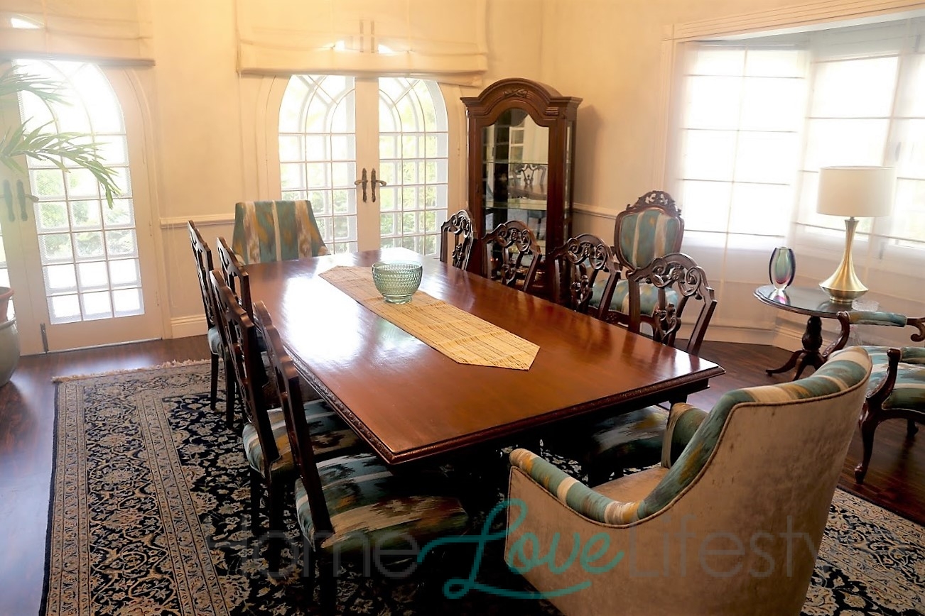
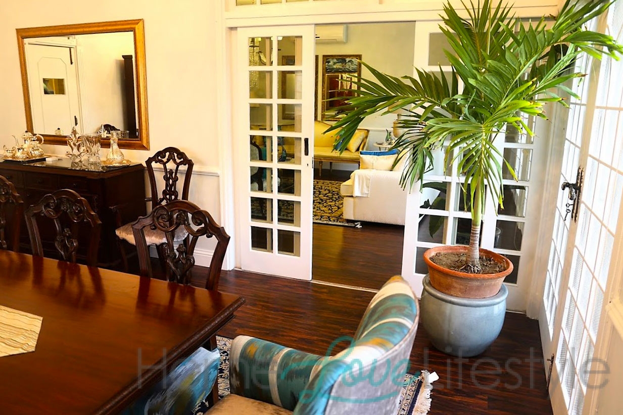
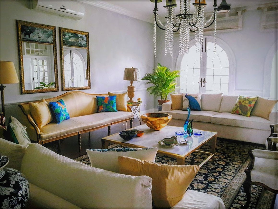
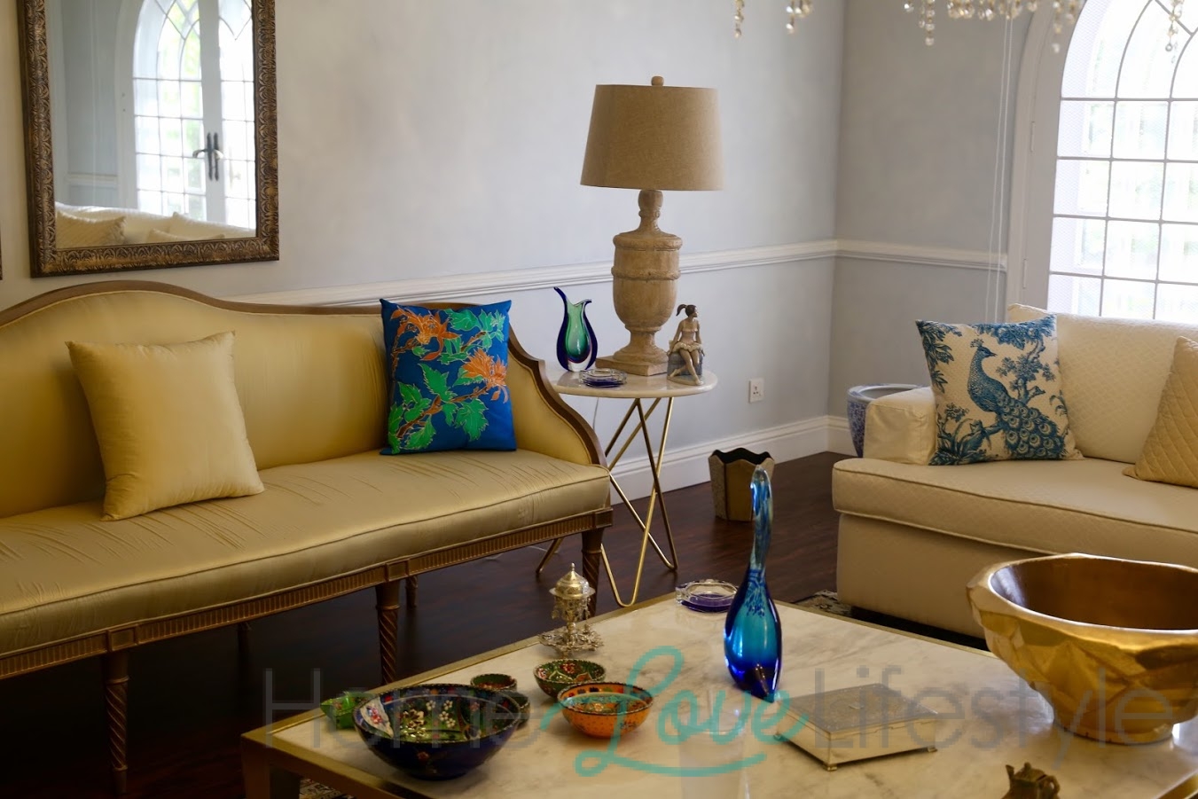
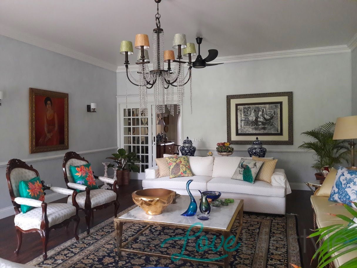
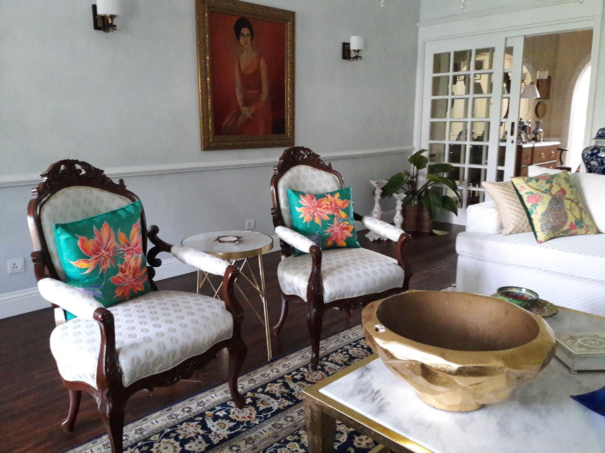
The formal living room walls were textured in shades of light blue. Since blue is considered to be one of the most versatile decorating colours, it was infused into the interior scheme in many ways. The colour palette was kept a simple light blue and white. The designers however added a hint of gold, as well as shades of blues and turquoise in the accessories.
Expert Additions
To add more character to the walls, a gypsum crown moulding and a chair rail was added. A laminated wooden floor was installed, which immediately brought warmth to the décor. In addition a crisp white broad floor skirting added even more finesse. The white against the timber makes a striking interior design impact.
A custom-made chandelier was also installed, using banarsi/jamaavar lampshades.
Updating & Renovating
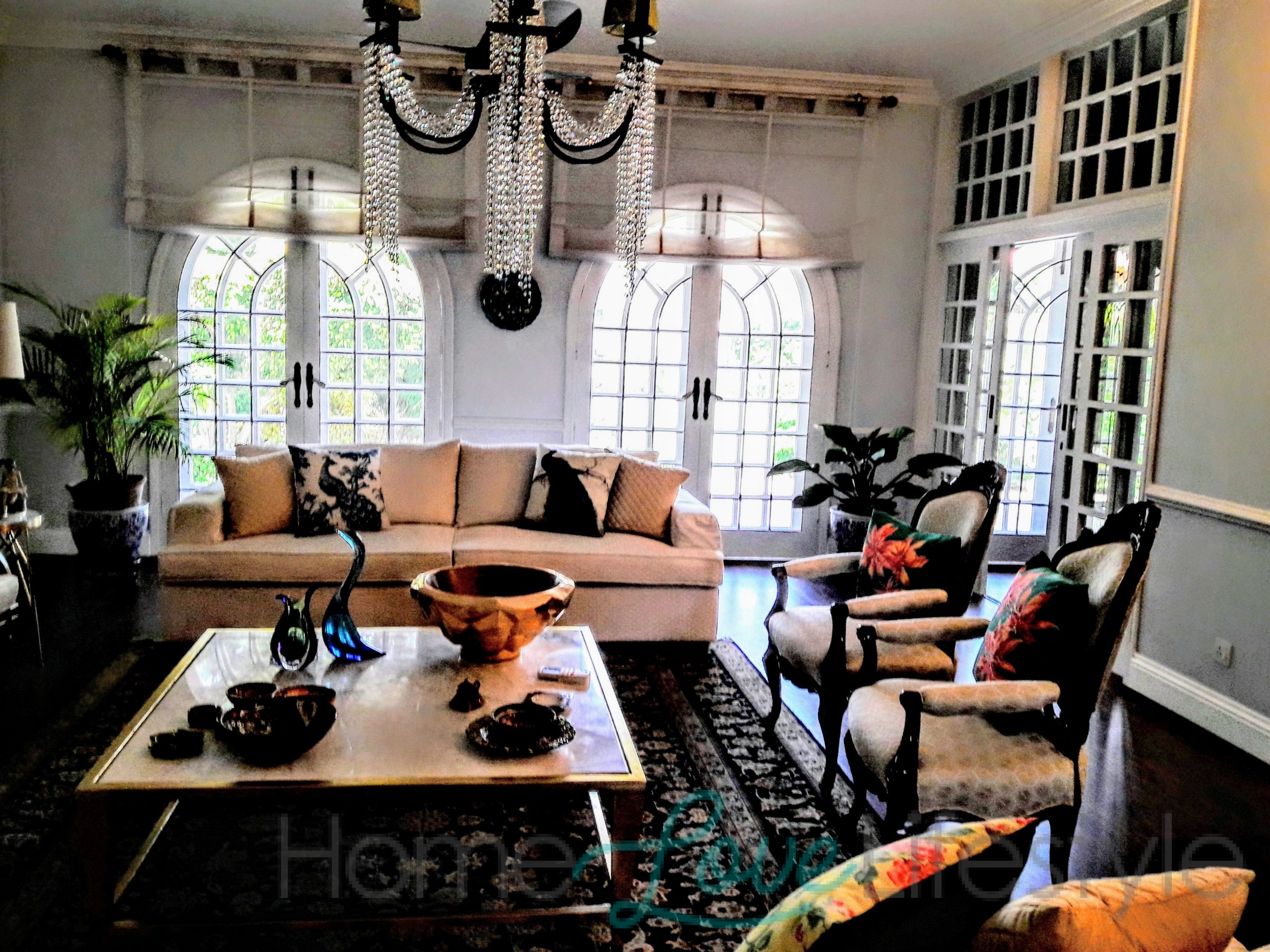
All the French doors and windows got a makeover by adding architraves and also mouldings. The doors and the windows were painted a fresh white. The window treatment was kept very simple and roman blinds in organza were hung from the ceiling. Curtains hung high can visually make a room feel larger and also one can maximise the sunlight that shines through.
Elegant Touches
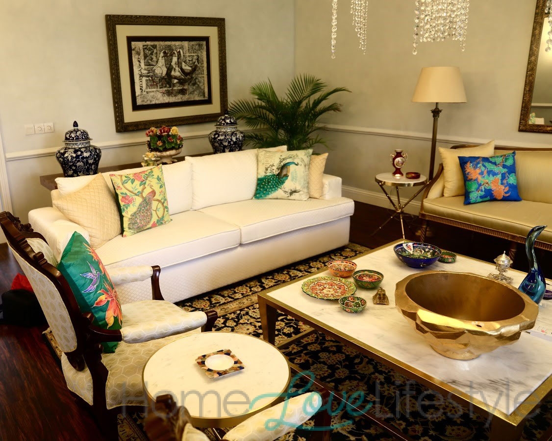
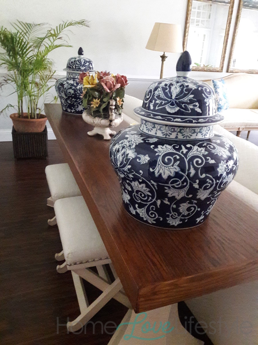
A central seating arrangement was preferred. The furniture was kept simple, upholstered sofas, with an accent Settee, paired with brass lamp tables all surrounded a very large coffee table. The homeowners are very well travelled and had quite a collection of accessories and signature art. This fit right into the décor scheme.
Entrance Re-imagined
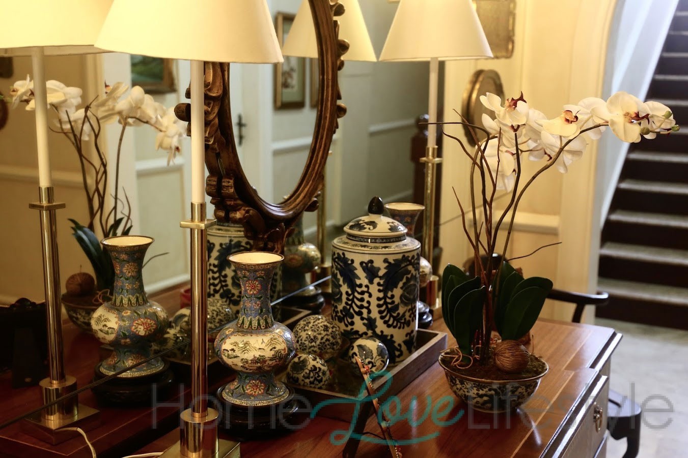
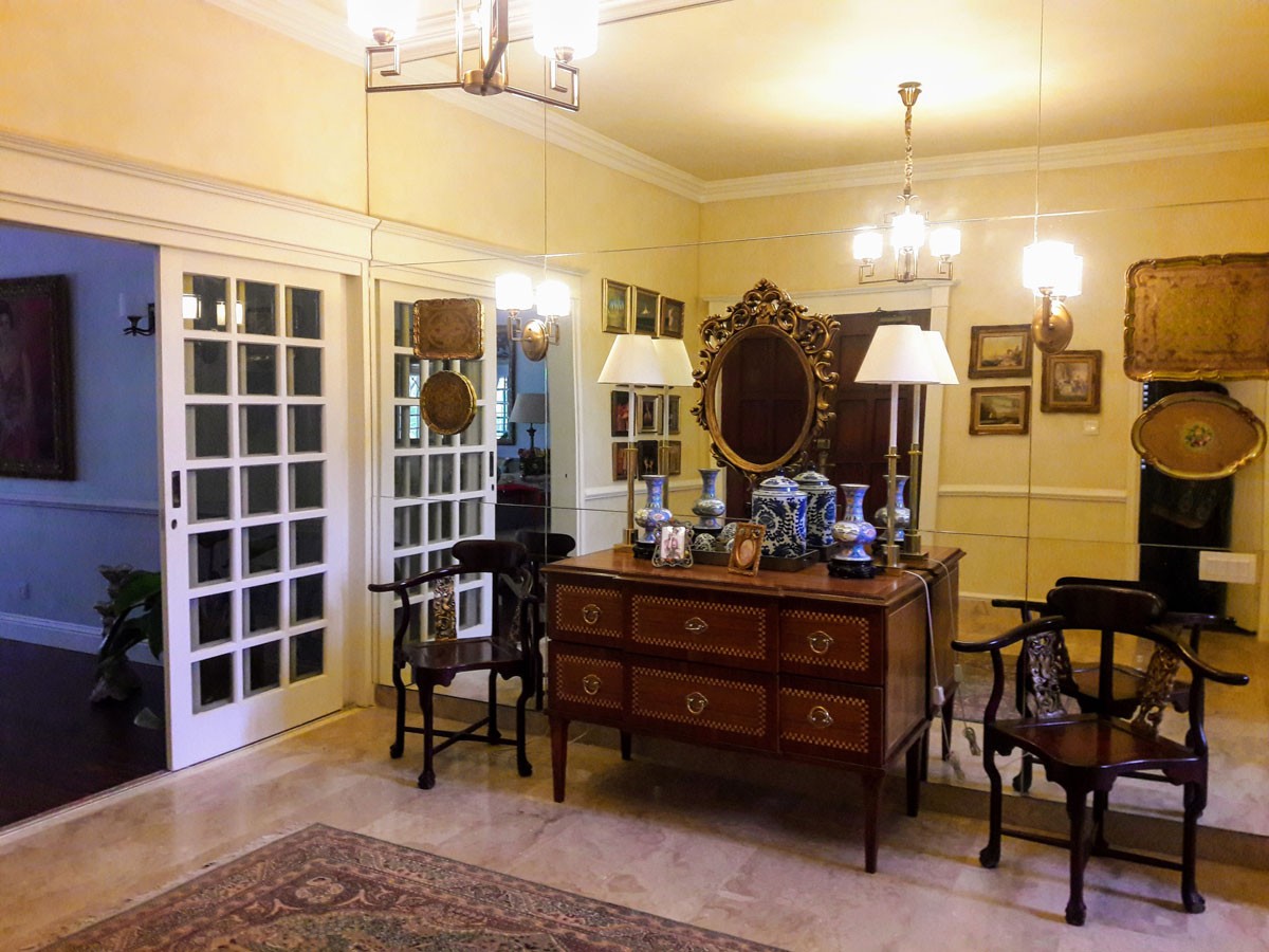
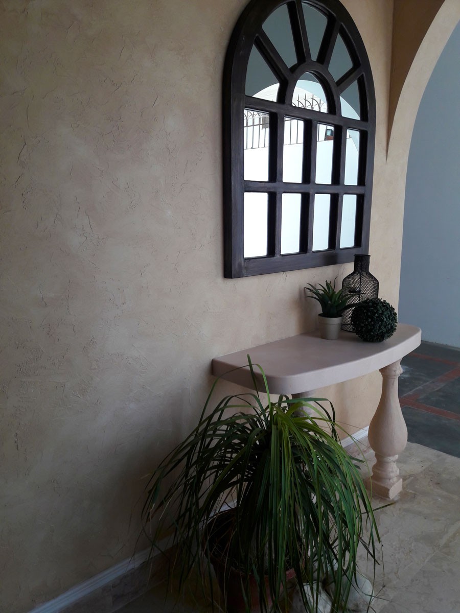
The entrance foyer needed some attention too, and here the clever use of mirrors made the foyer look much bigger than it is. A beautiful crafted wooden bureau with some accent chairs, mirror and art on the walls contributed to a warm welcoming entrance.
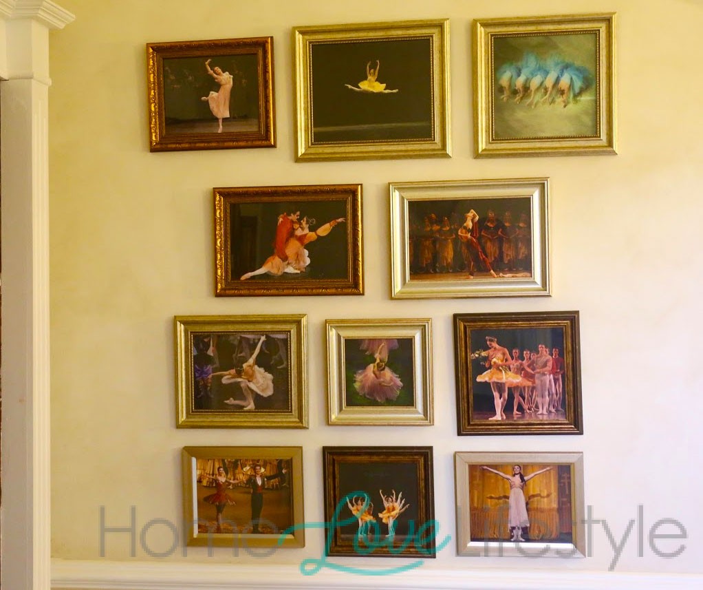
The home owner’s daughter is a keen and trained photographer, so some of her pieces were framed to adorn the wall.
The result is a very warm, bright and elegant home, which reflects the home owners.


